Conceptual brand identity for a local coffee house and bakery with a German flare, aimed at fostering community and connecting people.
Inspired by an abandoned storefront in the charming historic down-town area of Stone Mountain, we envisioned a local coffee shop and German bakery that connects the community by guaranteeing freshness and quality.
Roles: Concept Development, Visual Identity, Brand Strategy, Market Research, Photo Editing, Copywriting, Graphic Design, and Online Presence.
Collaboration: Sophia Presley, Knoxie Le Roux (Graphic Designer), and Caroline Goodson (Interior Designer).
Programs used: Adobe Illustrator, Adobe InDesign, Adobe Photoshop
Bonhaus German Bakery and Coffee House comprehensive brand package has received multiple regional and national awards from the American Advertising Federation, view here.
2023 National ADDY’s: Package Design (Gold ADDY), Typography (Silver ADDY).
Case Study: Bonhaus German Bakery & Coffee House
LOCATION, LOCALS, AND PEOPLE PASSING THROUGH.
Bonhaus is located in the heart of downtown Stone Mountain, curated to serve the local community and urban pass-throughs. The area is no stranger to people from Atlanta visiting the natural landscape of Stone Mountain, Bonhaus is the perfect in-between the bustling city of Atlanta and the serenity of Stone Mountain nature park. Bonhaus also caters to the needs of the local community.
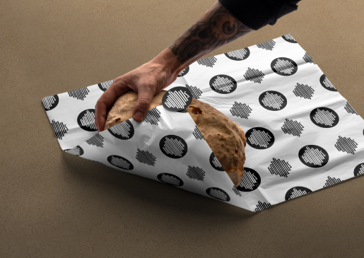
BRAND MARKS
The name Bonhaus comes from the German words ‘bohne haus’ meaning bean house. A place where you can get your coffee beans. To represent the brand, we crafted a typographic palette from which we built our brand marks. This included the typeface I designed, Nichi, a versatile sans-serif majuscule typeface designed used for online presence, sub-headings, supplementary headings, menus, and general content. Also, Chamberlain Black, a black-letter typeface designed by Knoxie le Roux for headings and decorative elements. Nimbus Roman is used where large groups of body copy is necessary.
BRAND STORY
The simplicity of the black and white approach allows for a professional and sophisticated feel while the brown paper texture leans more into making the product feel accessible and familiar. Moreover, the brown paper is part of the Bonhaus sustainability project, investing in the future generation of the community by making environmentally conscious decisions is a major part of the brand story.


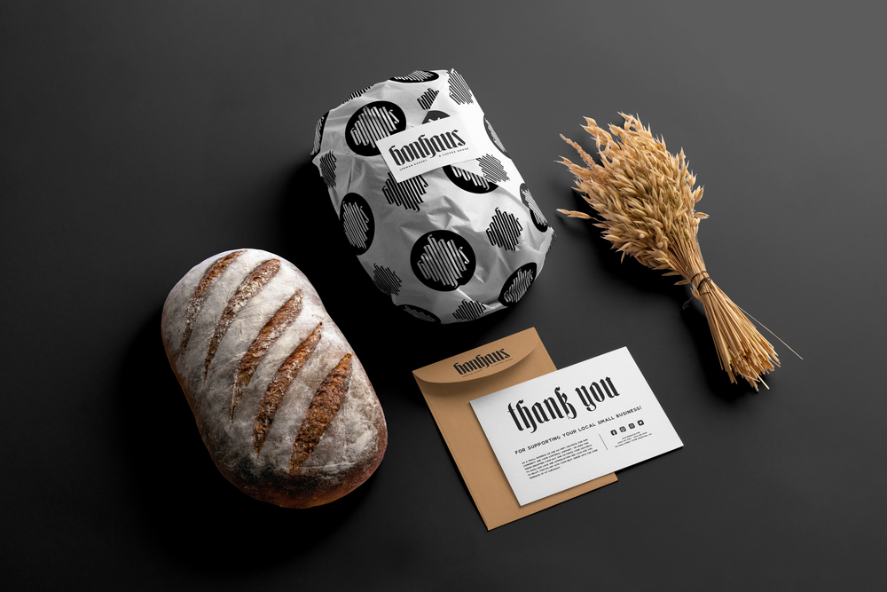

MERCH AND EPHEMERA
Part of fostering a community means endearing patrons to the brand through tangible elements. Shirts, sweatshirts and other Bonhaus branded elements, serve as visual signifiers in the community, posing an opportunity for new engagement and relationship. These things can be found in store or ordered online.
THE SPACE
Design Intent: A modern adaptation of Old-World German design, Bonhaus exercises the high contrast of stark blacks and whites, with the soft and sophisticated browns of wood and leather. Inspired by the collaboration of the streamline Nichi, and calligraphic Chamberlain Black typefaces, the space was designed to foster community and inspire creativity. In maintaining the historical integrity of the space, layers of the past fused with the richness of the present, thoughtfully inspiring the future.


THE BONHAUS FOOD TRUCK
Part of investing in the community means that we want to be able to meet you where you are. The Bonhaus Mobile is a fun way to go into the city and be a part of special events.
WEBSITE, MOBILE APP, SOCIAL MEDIA.
The Bonhaus website and mobile app is here for our customers to interact and connect through online ordering, online shopping, and our socials. Bonhaus online presence is supported by the brandmark and color palette. No part of the brand is untouched by the pairing of Chamberlain Black and Nichi. The website is infused with our natural colors and grungey feel.


*Photos are for conceptual purposes only, I do not claim the rights.